F
Project Header Image
Illustration

Wanka Foods

Client Wanka Foods
Year 2021
Role Packaging / Illustration
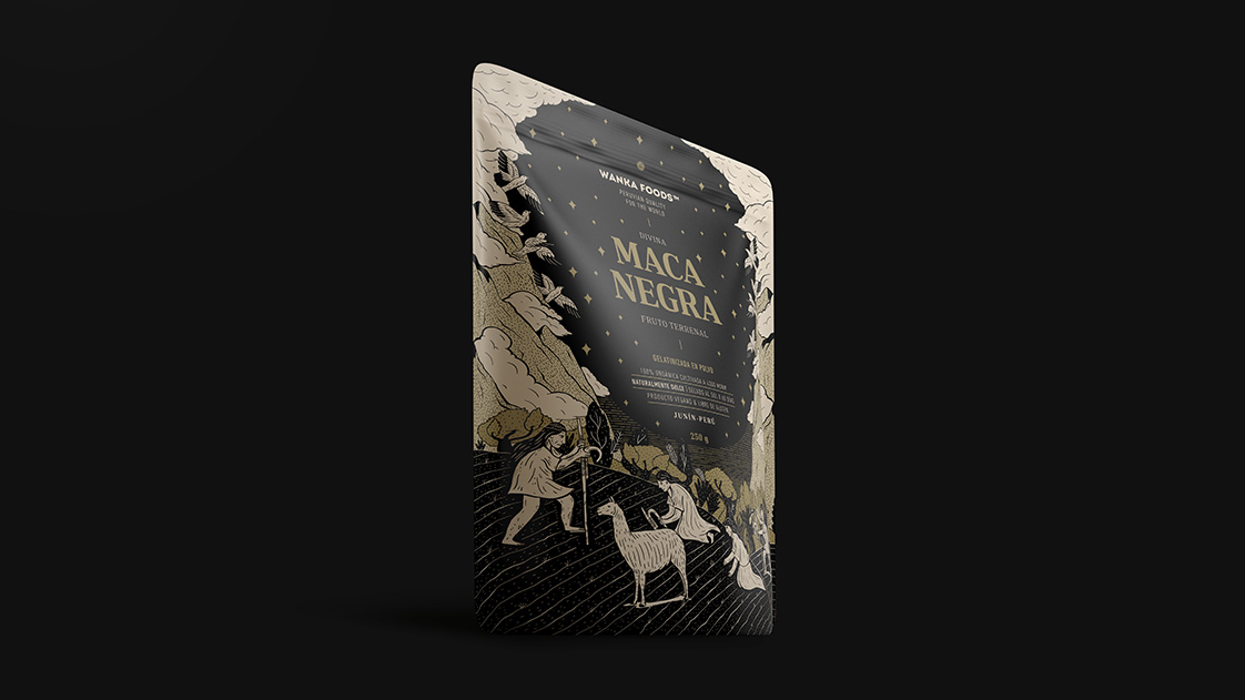
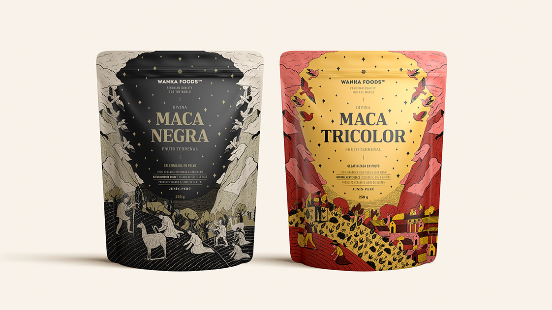
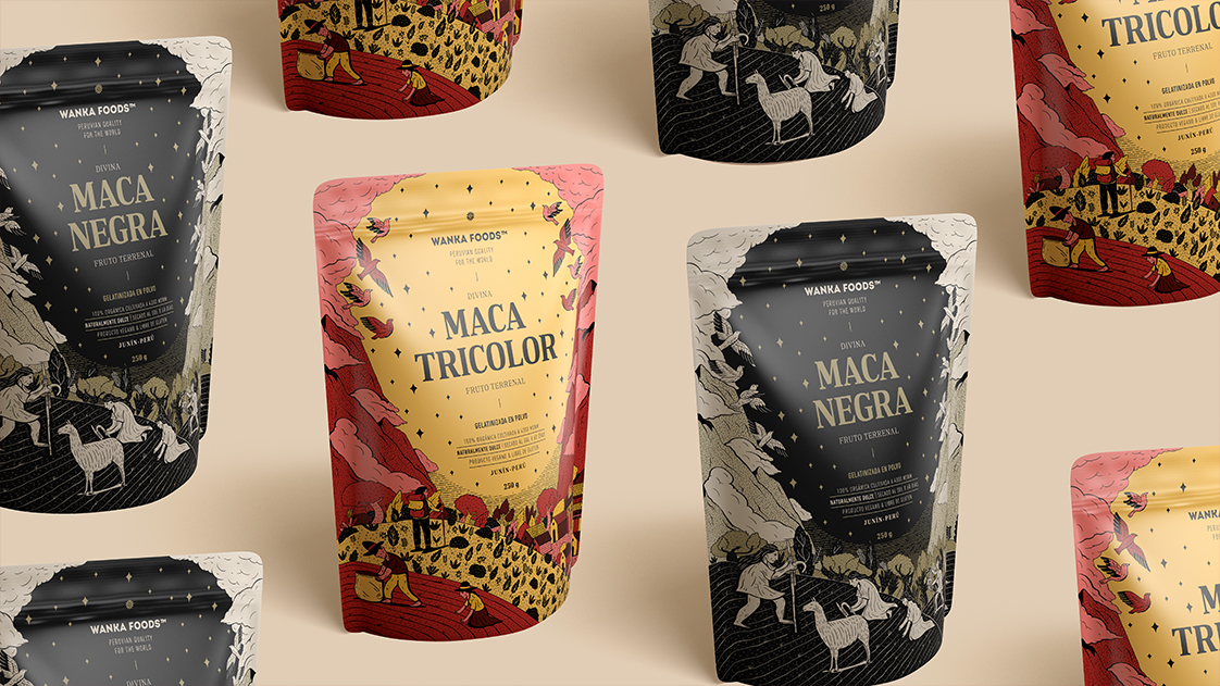
Wanka Foods was born to keep the Huanca culture alive through products made from superfoods from the central highlands of Perú. The Huanca were warrior people, farmers and ranchers. They lived on the tops hills, where they had the ideal height and climate for growing their food. The packaging for Wanka’s black and tri-color maca show the process of growing the product in that specific territory. Our goal was to be an interesting brand for the western audience. The challenge, however, was to stand out in a category that repeatedly abuses certain visual codes: use of white backgrounds, green markings, photo of the ingredient in its natural and powdered state, etc.

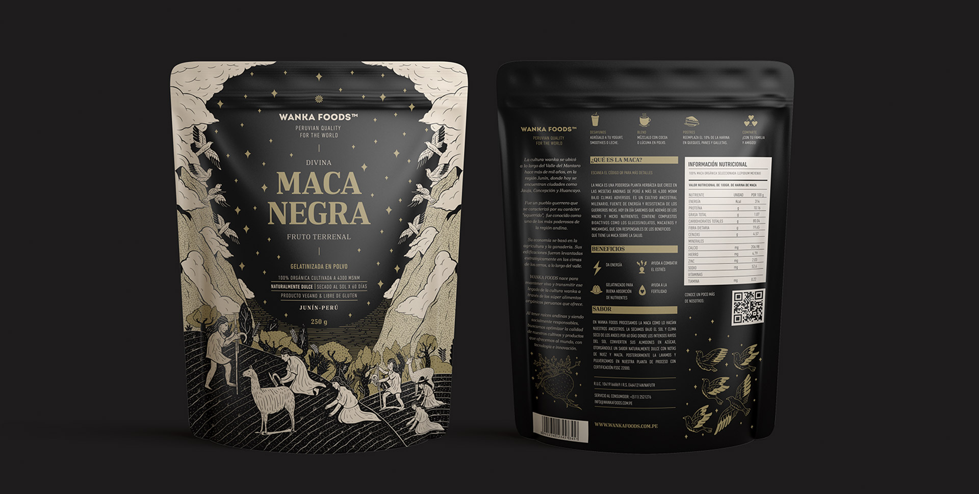
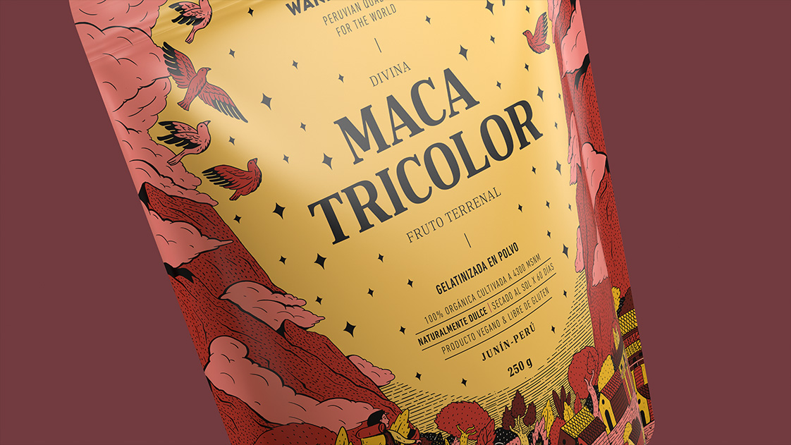
We seek to visually narrate the cultivation process and the origin of maca to give the consumer a helpful context. Maca is cultivated at 3,500 meters above sea level, and in the past it was made with a chaquitaclla, a farming instrument designed in the Tahuantinsuyo era and which is used to this day. Thus, we relieve the purpose of keeping an ancestral culture alive.

The packaging is a tribute to hard work in the field and in the heights. We refer to the chronicler Huamán Poma de Ayala to create the illustrations and the composition of the packaging: we divide it into two planes, the upper part is the divine plane and the lower part the earthly plane. The end result is a brand that finds the perfect balance between premium quality and pride in its origin and history.

In the year 2016 in Perú, foods created for export were not focused on storytelling or branding. This opened up a great opportunity for us to craft a proposal that stood out in the market and transmitted the brand’s values in a visual and attractive manner.

Single Image
Single Image
Single Image
Single Image
Single Image