Our task was to craft the rebranding and repackaging strategy for a brand which had a significant obstacle ahead of them: the lack of knowledge Peruvians have regarding the consumption of high quality tonic water.
The brand was born and grew with the limited budget a start-up typically has; years later, it was time for its identity to live up to the product they were producing.
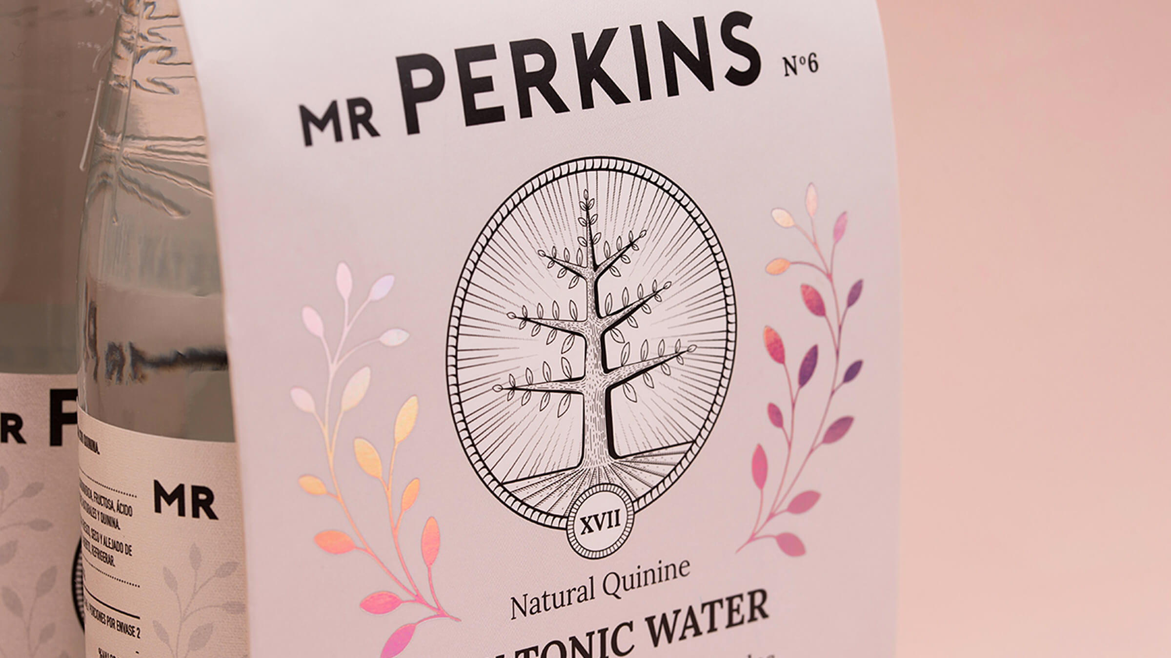
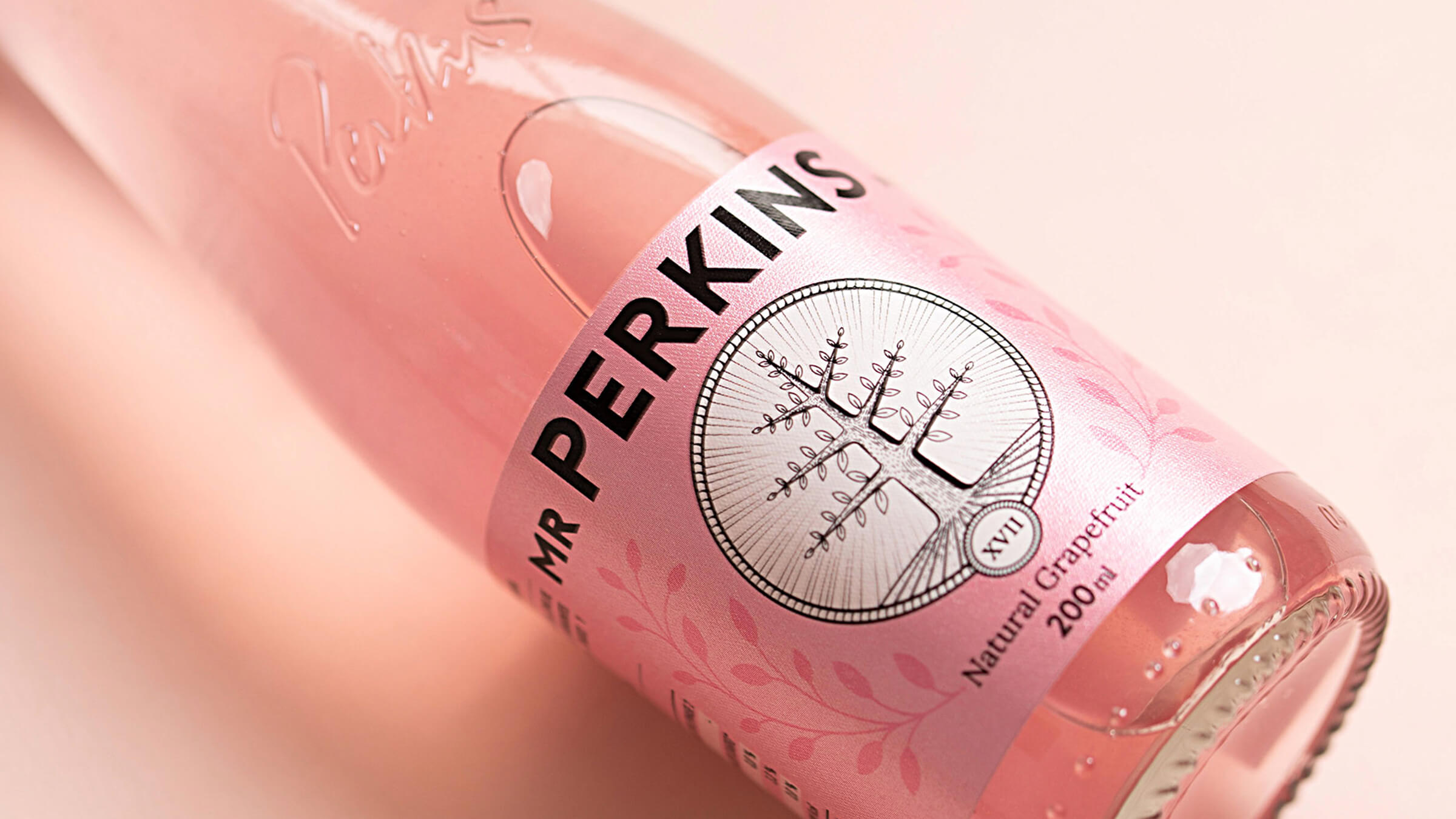
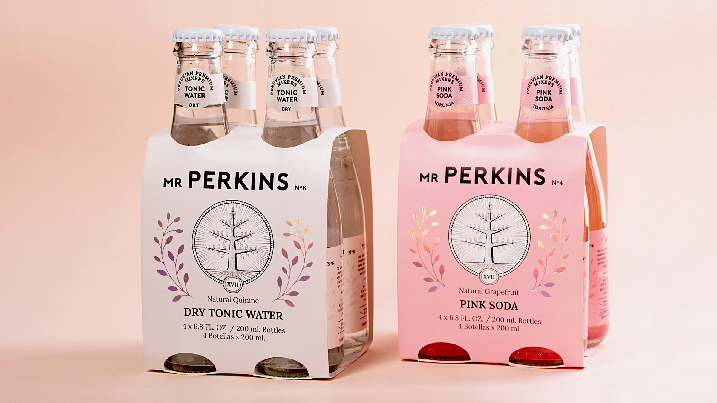
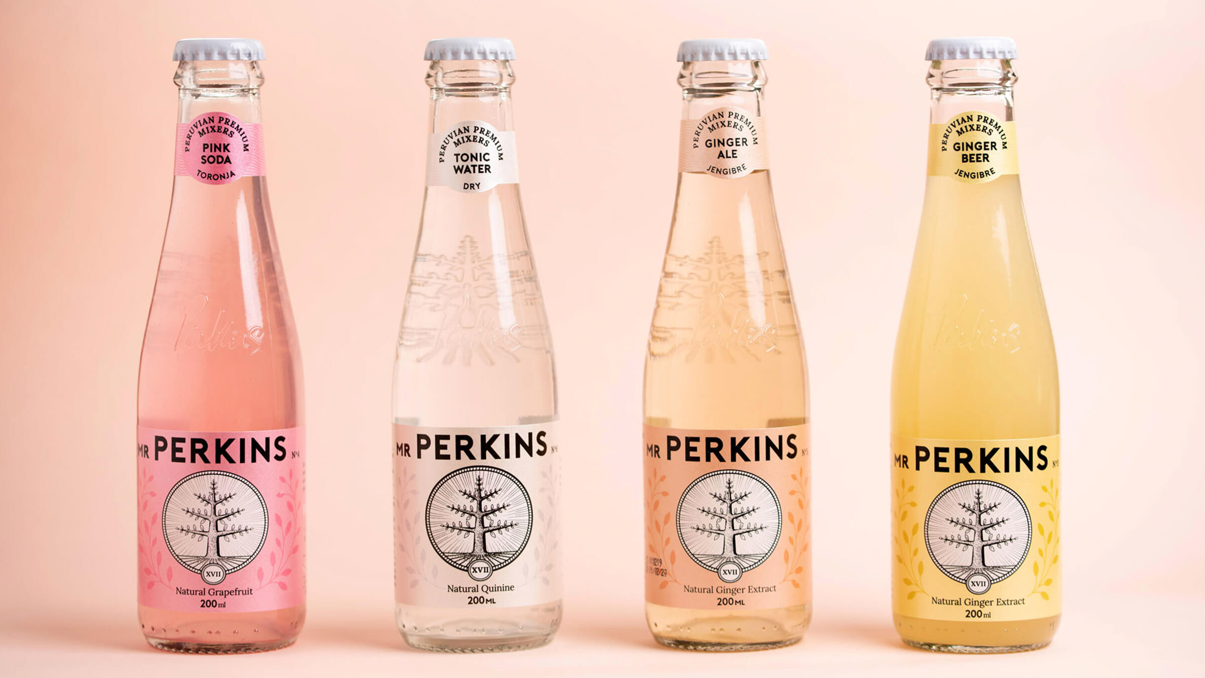
In order to refresh its image, elevate its perception of quality, and give it a close and modern touch, we used a pastel palette, we changed the font of the logo for a sans serif, and we removed the prominence from the abbreviation of “Mister” (MR) , since consumers commonly call it only “Perkins”, and it was probable that in the future this abbreviation would be eliminated. We redesigned the cinchona tree and calculated its deformation in the arch of the bottle so that, when it was printed, it continued to be seen as a circle and not as an oval; we cleaned it up significantly. To provide a natural feel, we designed borders made from the leaves of the cinchona tree, and we placed them around the tree, as if they were on a coat of arms. On the labels, we highlighted these borders and added a holographic foil to give it a premium finish.
To differentiate ourselves from other brands of mixers, we used pearl paper on the labels, which is very common in the champagne industry but not in the mixers industry. Each mixer is numbered from one to six, referring to the order in which each formula was released out in the market, creating the sensation of a premium collection. The product is of world-class quality, and we had to design a Peruvian brand that felt world-class, without being perceived as “unattainable”.
Unfortunately, Peruvians currently believe that if a product is made in Perú, it does not have the same quality, and is not as well made as a product from abroad. Mr Perkins broke this stigma with its “make it better” philosophy.