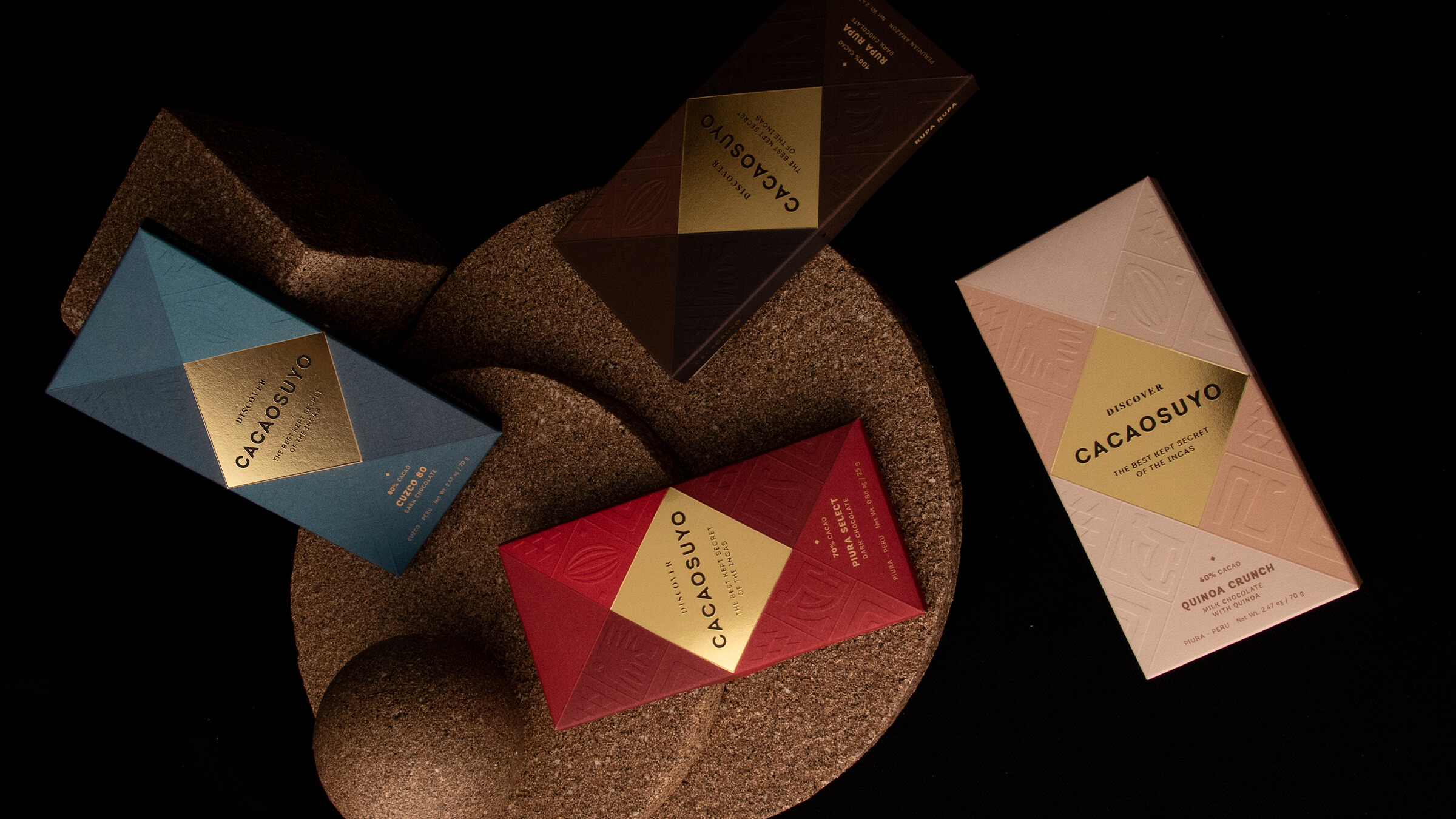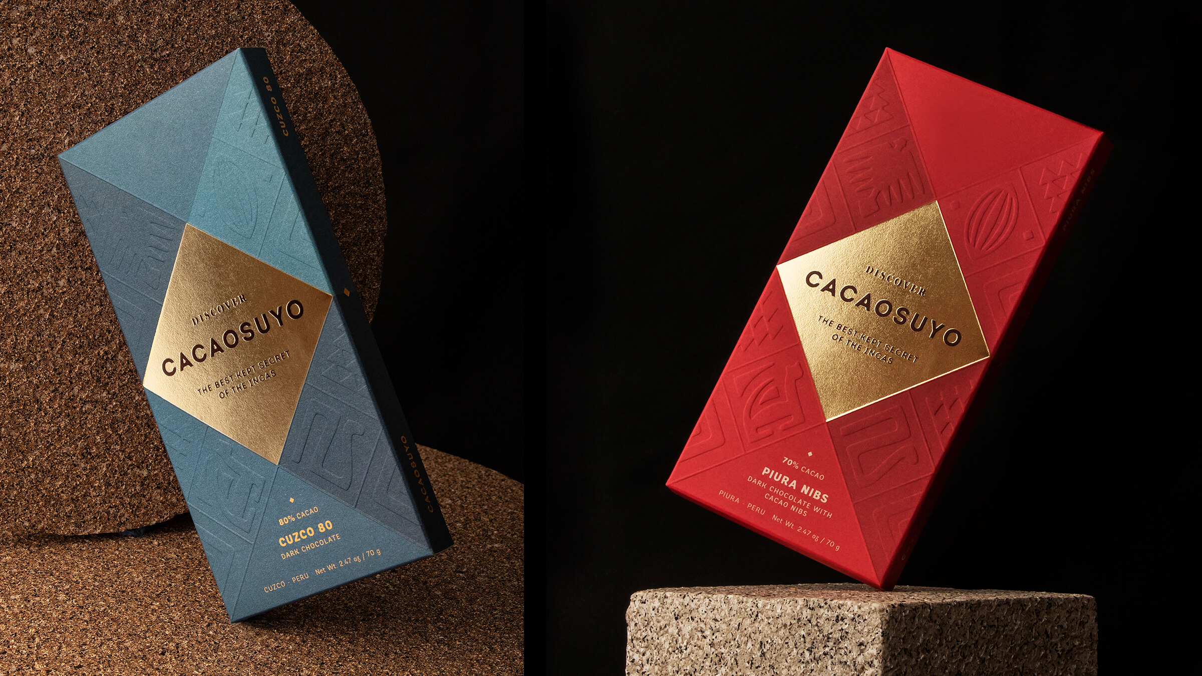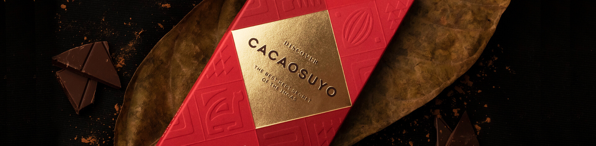
Packaging Rebranding
Cacaosuyo
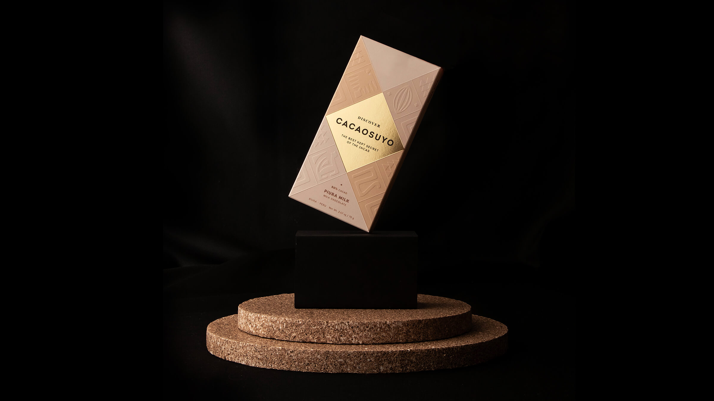
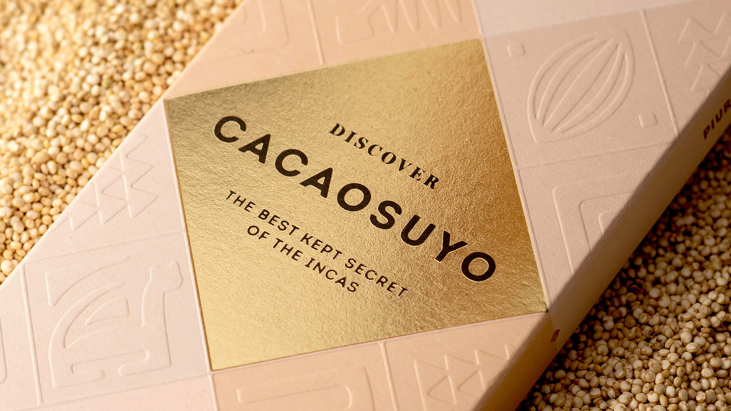
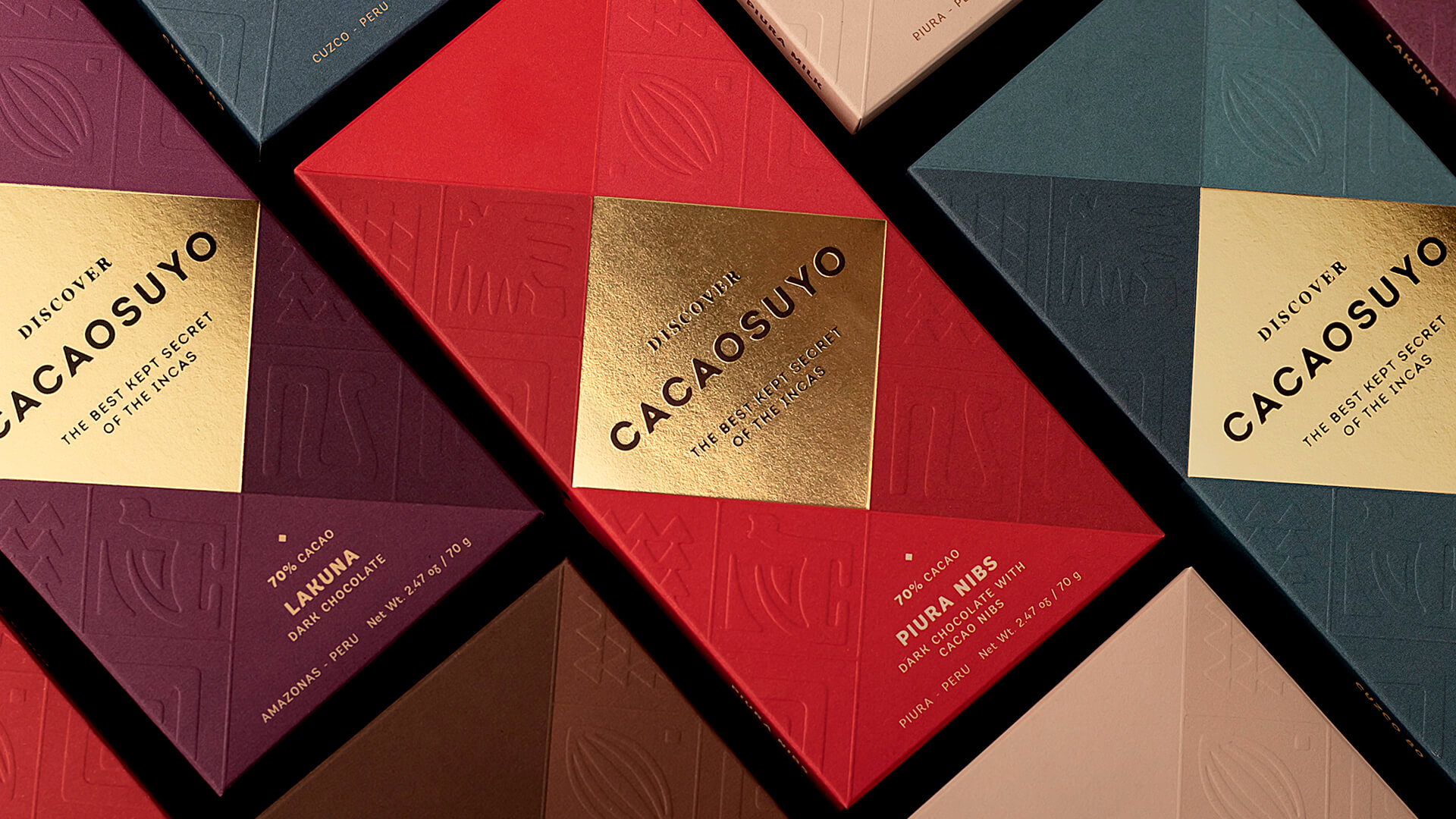
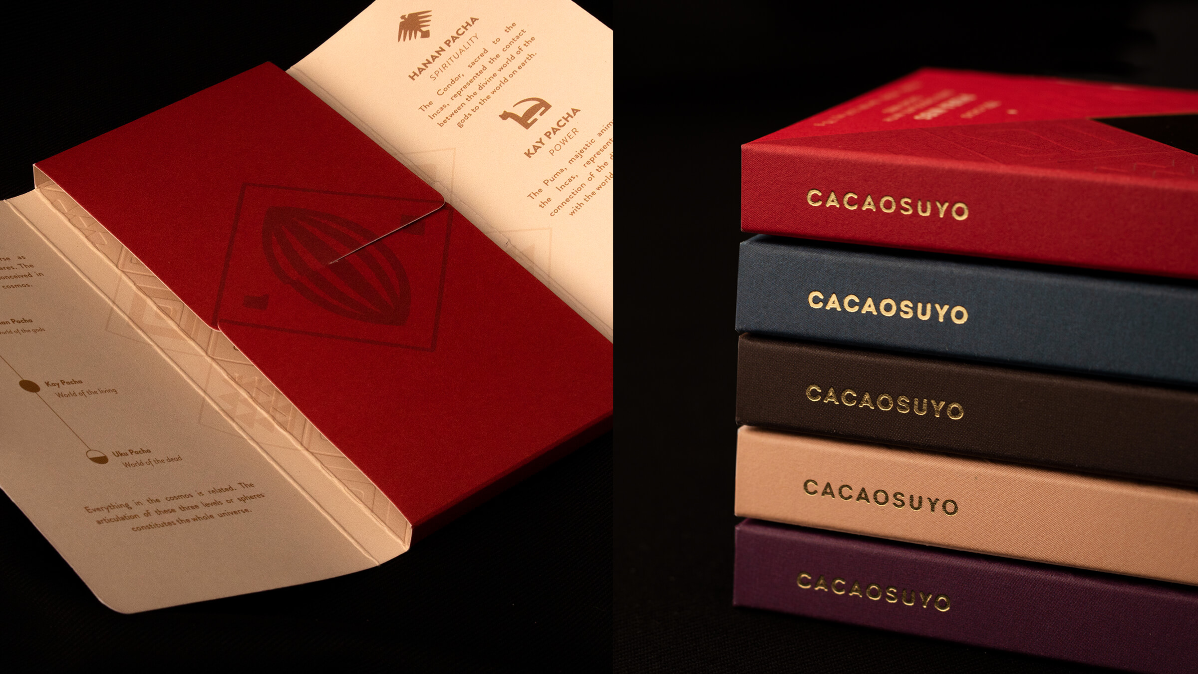
Many theories indicate that Perú is where cacao originated. Cacaosuyo, which means “cacao territory”, is a brand which seeks to represent the legendary origin of the fine chocolate of Perú. Our task was to redesign the packaging of a brand that has received multiple awards for its product, and ensure that the message was one that allowed Cacaosuyo to compete in international markets. The gourmet chocolate category is a very competitive one world-wide in terms of design, and this was a wonderful challenge for us to undertake.